Interpreting a Visualization of a Point and Estimate of a Population Mean for Small Samples (t-distribution)
Overlapping Bell Curves with Confidence Intervals for t-distribution (df=19)
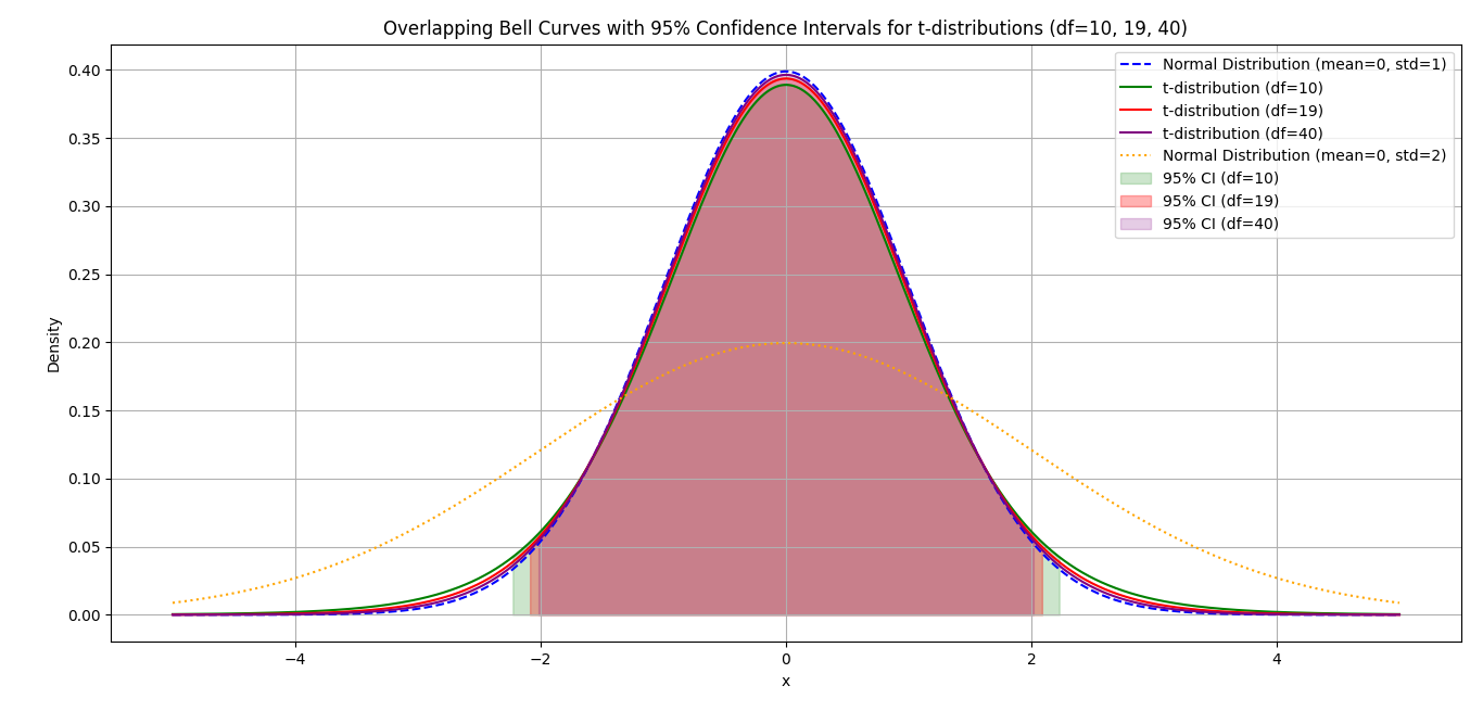
- The t-distribution is wider and lower compared to the normal distribution, especially with small sample sizes.
- As the sample size and degree of freedom increase, the t-distribution curve approximates the normal distribution.
- A lower degree of freedom (df) leads to a larger region for population mean estimates at a 95% confidence level, reflecting how small sample sizes increase variability in the sampling distribution.
Comparing a t-distribution and a normal distribution
What is the primary difference between a t-distribution and a normal distribution?
t-distribution have heavier tails than the normal distribution
Why does the t-distribution have heavier tails than the normal distribution?
Sample size increase and the shape of the t-distribution
As the sample size increases, what happens to the shape of the t-distribution?
95% confidence interval
What does a 95% confidence interval represent?
(df) and the t-distribution
How does the degree of freedom (df) affect the t-distribution?
Sample size increase and the confidence interval
What happens to the confidence interval when the sample size increases?
Lower degree of freedom (df)
What effect does a lower degree of freedom (df) have on the confidence interval for the population mean at a 95% confidence level?
Sample Python Script to recreate this output
import numpy as np
import matplotlib.pyplot as plt
from scipy.stats import t, norm
x = np.linspace(-5, 5, 1000)
normal_curve = norm.pdf(x, 0, 1)
t_curve_19 = t.pdf(x, 19)
t_curve_10 = t.pdf(x, 10)
t_curve_25 = t.pdf(x, 25)
normal_curve_2 = norm.pdf(x, 0, 2)
CI_95 = 0.95
CI_90 = 0.90
CI_99 = 0.99
t_critical_90_19 = t.ppf(1 - (1 - CI_90) / 2, df=19)
t_critical_95_19 = t.ppf(1 - (1 - CI_95) / 2, df=19)
t_critical_99_19 = t.ppf(1 - (1 - CI_99) / 2, df=19)
plt.figure(figsize=(10, 6))
plt.plot(x, normal_curve, label='Normal Distribution (mean=0, std=1)', color='blue', linestyle='--')
plt.plot(x, t_curve_19, label='t-distribution (df=19)', color='red')
plt.plot(x, normal_curve_2, label='Normal Distribution (mean=0, std=2)', color='green', linestyle=':')
plt.fill_between(x, 0, t_curve_19, where=(x >= -t_critical_90_19) & (x <= t_critical_90_19), color='red', alpha=0.2, label='90% CI (df=19)')
plt.fill_between(x, 0, t_curve_19, where=(x >= -t_critical_95_19) & (x <= t_critical_95_19), color='red', alpha=0.3, label='95% CI (df=19)')
plt.fill_between(x, 0, t_curve_19, where=(x >= -t_critical_99_19) & (x <= t_critical_99_19), color='red', alpha=0.4, label='99% CI (df=19)')
plt.title('Overlapping Bell Curves with Confidence Intervals for t-distribution (df=19)')
plt.text(0.5, 1.0, 'Overlapping Bell Curves with Confidence Intervals for t-distribution (df=19)', ha='center', va='top')
plt.xlabel('x')
plt.text(0.5, 0, 'x')
plt.ylabel('Density')
plt.text(0, 0.5, 'Density')
plt.legend()
plt.grid(True)
plt.tight_layout()
plt.show()
t_curve_10 = t.pdf(x, 10)
t_curve_19 = t.pdf(x, 19)
t_curve_40 = t.pdf(x, 40)
normal_curve_2 = norm.pdf(x, 0, 2)
CI_95 = 0.95
t_critical_95_10 = t.ppf(1 - (1 - CI_95) / 2, df=10)
t_critical_95_19 = t.ppf(1 - (1 - CI_95) / 2, df=19)
t_critical_95_40 = t.ppf(1 - (1 - CI_95) / 2, df=40)
plt.figure(figsize=(10, 6))
plt.plot(x, normal_curve, label='Normal Distribution (mean=0, std=1)', color='blue', linestyle='--')
plt.plot(x, t_curve_10, label='t-distribution (df=10)', color='green')
plt.plot(x, t_curve_19, label='t-distribution (df=19)', color='red')
plt.plot(x, t_curve_40, label='t-distribution (df=40)', color='purple')
plt.plot(x, normal_curve_2, label='Normal Distribution (mean=0, std=2)', color='orange', linestyle=':')
plt.fill_between(x, 0, t_curve_10, where=(x >= -t_critical_95_10) & (x <= t_critical_95_10), color='green', alpha=0.2, label='95% CI (df=10)')
plt.fill_between(x, 0, t_curve_19, where=(x >= -t_critical_95_19) & (x <= t_critical_95_19), color='red', alpha=0.3, label='95% CI (df=19)')
plt.fill_between(x, 0, t_curve_40, where=(x >= -t_critical_95_40) & (x <= t_critical_95_40), color='purple', alpha=0.2, label='95% CI (df=40)')
plt.title('Overlapping Bell Curves with 95% Confidence Intervals for t-distributions (df=10, 19, 40)')
plt.text(0.5, 1.0, 'Overlapping Bell Curves with 95% Confidence Intervals for t-distributions (df=10, 19, 40)')
plt.xlabel('x')
plt.text(0.5, 0, 'x', ha='center', va='bottom')
plt.ylabel('Density')
plt.text(0, 0.5, 'Density')
plt.legend()
plt.grid(True)
plt.tight_layout()
plt.show()
Additional Tangible Experience for this Lesson
Additional Notes: Please save the script as a .py file and save it to your desktop.
Step 1. At your terminal (just type "cmd" in the search box of your OS):
Step 2. Run the script by following this command template:
Please save the script as a .py file and save it to your desktop.
Step 1. At your terminal (just type "cmd" in the search box of your OS):
Step 2. Run the script by following this command template:
- Prerequisites for Running the Script:
Ensure that you:
- Have Python installed (preferably version 3.7 or higher).
- Have
pipinstalled for managing Python packages.
- Virtual Environment (Optional): It’s a good practice to create a virtual environment for your project to avoid package conflicts. Here’s how you can do it:
Please save the script as a .py file and save it to your desktop.
Step 1. At your terminal (just type "cmd" in the search box of your OS):
Step 2. Run the script by following this command template:
python "C:\Users\<Your Name>\Desktop\<Folder Name>\<Script Filename>"
Example:
python "C:\Users\Annauen Joy Ravacio\Desktop\PYTHON SCRIPTS\Small Sample t-curve.py"
Have fun! Thank you for your kind support.