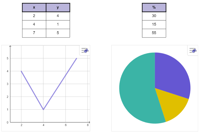
 | Select the Table tool and tap into the canvas. A Bounding Box appears and you can start typing in the table.
Note: By default the table has 2 rows and 2 columns. |
 | Select the Bounding Box to get the Style Bar, where you can change the style and color of the text of your table. |
 | Click inside one cell. Open the context menu by pressing the More button. Insert rows above/below or columns left/right to the selected cell to get more cells for your table. |
 | Choose between a left, center or right horizontal align in the Style Bar for the selected table or cells.
Note: If you select the whole table, your settings will affect all cells.
|
 | Choose between a top, middle or bottom vertical align in the Style Bar for the selected table or cells.
|
 | Choose how you would like to display the borders in the Style Bar, all borders, just the inner/outer borders or no borders for the selected table or cells.
|
 | In addition change the line thickness of your borders in the Style Bar when selecting the drop-down-menu for the border options. |
 | Open the context menu by pressing the More button. There you'll find further Settings for your table (e.g.: Font, Text wrapping). |
 | If you would like to get a heading for your table, select Heading from the context menu and choose between Row or Column. The top row or left column will then be highlighted. |
 Table tool from the
  Move tool and learn how to create charts from tables.
 Table tool from the


